Your pricing page is more than just a list of numbers – it’s where your users make their most critical decision: “Is this worth it?”
For many SaaS businesses and digital platforms, the pricing page is either closing deals or leaking leads. There’s no middle ground.
In this article, we’ll break down how to transform your pricing page into a high-converting asset using proven UX and CRO principles – so you can boost conversions without changing your actual pricing.
Why Your Pricing Page Matters
Pricing isn’t just about cost — it’s about perceived value. A confusing layout, vague plan names, or hidden CTAs can make even a great offer feel untrustworthy.
A well-optimized pricing page does three things:
1. Explains value clearly
2. Builds trust and reduces friction
3. Guides users to take action confidently
5 Core Principles of High-Converting Pricing Pages
1. Clarity Comes First
If users don’t immediately “get” what you offer, they leave.
Checklist:
• Clear, benefit-driven headline (e.g., “Optimize UX & CRO in Minutes”)
• Plan names that reflect audience or goals (“Startup,” “Growth,” “Enterprise” > “Basic/Pro”)
• Subheadings that explain who each plan is for
• Jargon-free feature descriptions
• Visual hierarchy that guides the eye
Pro Tip: The faster someone understands what they’re buying, the faster they convert.
2. Frame the Value, Not Just the Price
Many pages list features — but features don’t sell. Outcomes do.
Checklist:
• Describe what the user gains, not just what they get
• Use comparison tables that are scannable and not overwhelming
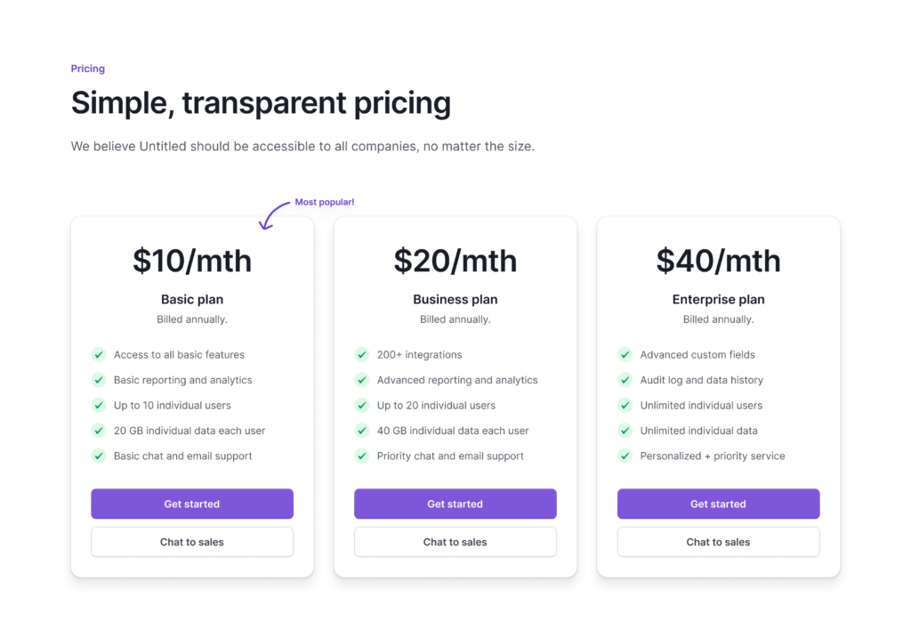
• Emphasize a “Most Popular” plan to reduce decision fatigue
• Show cost vs. value (e.g., “Save 10 hours a week” or “Boost signups by 23%”)
Pro Tip: If a user can’t see how it helps them, the price always feels too high.
3. Build Confidence with Social Proof
Many pages list features — but features don’t sell. Outcomes do.
Buyers are skeptical. Your job is to make the decision feel safe.
Checklist:
• Add testimonials with names, photos, and titles
• Showcase customer logos (especially well-known ones)
• Include trust badges (G2, Capterra, etc.)
• Offer a risk-free trial, refund guarantee, or “no credit card required” CTA
Pro Tip: Confidence converts. Use every tool you can to reduce uncertainty.
4. Remove Friction and Objections
If users are unsure, they pause. Pauses kill conversions.
Checklist:
• Include a mini FAQ right below your pricing
• Answer common objections like:
• “What if I need to upgrade later?”
• “How does onboarding work?”
• “Is this self-serve or do I need support?”
• Offer both a “Start Free Trial” and a “Talk to Sales” option
• Ensure your support contact (live chat or email) is easy to find
Pro Tip: The more questions you answer upfront, the fewer excuses your users have to delay.
5. Guide Users to Act
You’ve explained the value, built trust, and answered questions — now make it easy to convert.
Checklist:
• One clear, consistent CTA (e.g., “Start Your Free Trial”)
• Repeat the CTA after every key section
• Use benefit-driven microcopy under the button (e.g., “No credit card required”)
• Remove distracting links or nav bars near pricing
Pro Tip: A confused or distracted user doesn’t buy. Make the next step painfully obvious.
Bonus: Audit Your Current Pricing Page
Here are some quick questions to self-assess your pricing page:
• Can a visitor tell what your product does in 5 seconds?
• Are your plan names and descriptions easy to understand?
• Is the value of each plan clearly visible?
• Do you provide proof that others trust you?
• Are your CTAs consistent, repeated, and action-focused?
• Is there an obvious next step — whether it’s to start a trial or speak to someone?
Final Thoughts
Your pricing page is one of the highest leverage areas of your entire website.
Get it right, and you’ll close more deals, shorten sales cycles, and increase revenue — all without spending a dime on ads.
Start with clarity. Add trust. Remove friction. Then guide users to act.
Need help auditing your own pricing page? Reach out or try our audit checklist. We’ll help you spot friction points and opportunities that could unlock more conversions, instantly.

